BRANDING
Refreshing an established brand presents a unique challenge. How do you introduce something new without losing the familiarity and recognition built over decades?
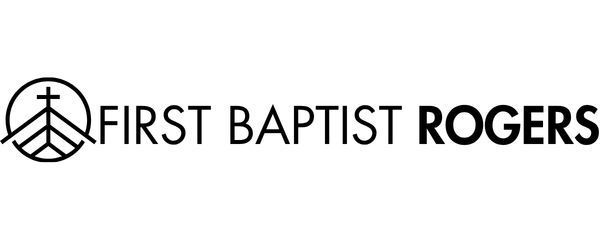
First Baptist Rogers has used several variations of its logo over the years, beginning with a four-color oval divided by a cross. The design eventually evolved into a simplified, monochromatic symbol affectionately known as the "sail."
While recognizable, the unusual shape and asymmetrical design presented challenges when incorporating the mark into different layouts and applications.


Although the church placed its formal rebranding process on hold, I continued exploring possibilities for a future refresh.
One priority was maintaining recognizable typography while making the brand easier for staff and volunteers to use. As ministries began taking greater responsibility for their own graphics, accessible fonts and straightforward brand standards became increasingly important.
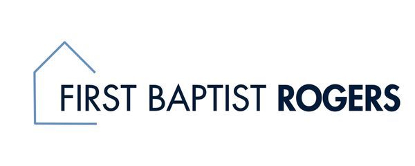
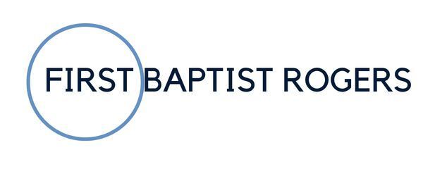
I explored variations in typography, icon shapes, framing elements, and overall composition, looking for ways to modernize the identity without losing its history.
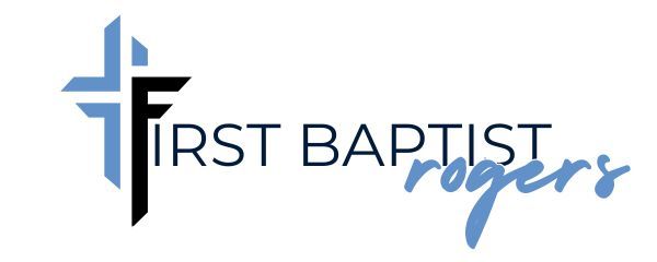
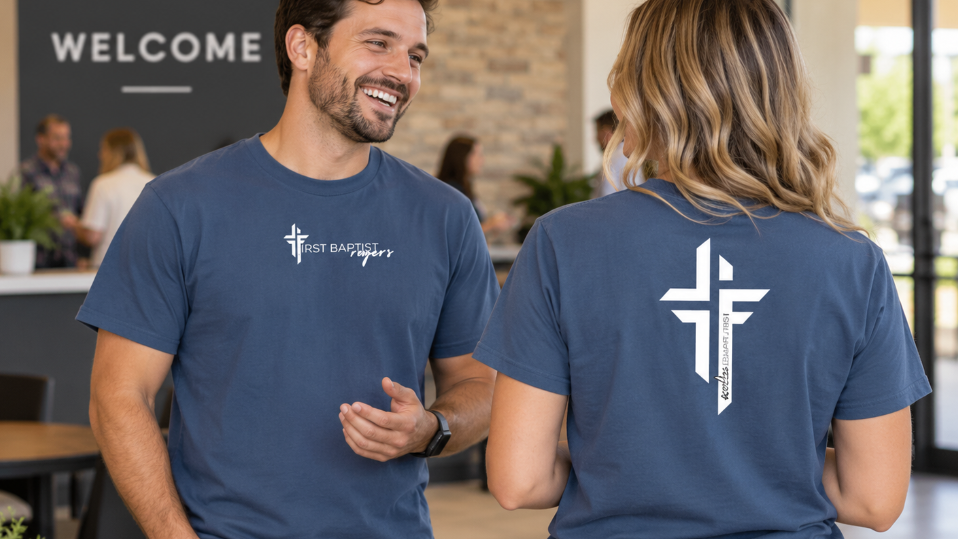
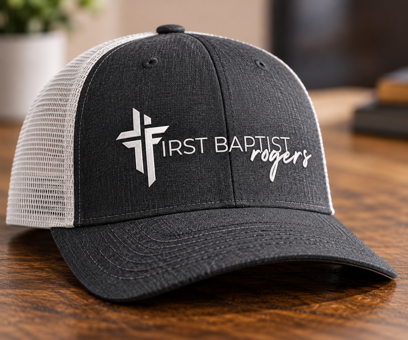
The concept I ultimately developed pays homage to the original "sail" while introducing cleaner, more geometric shapes. It retains a sense of asymmetry but uses stronger lines and a more flexible construction.
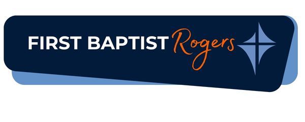
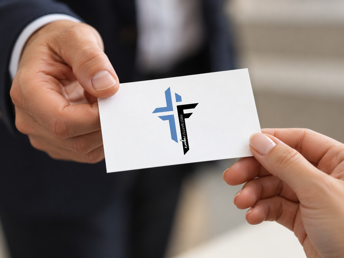
The cross becomes an integral part of the church's name while also functioning as a standalone brand mark. I also explored alternative typography treatments, including one with a slightly more approachable personality.


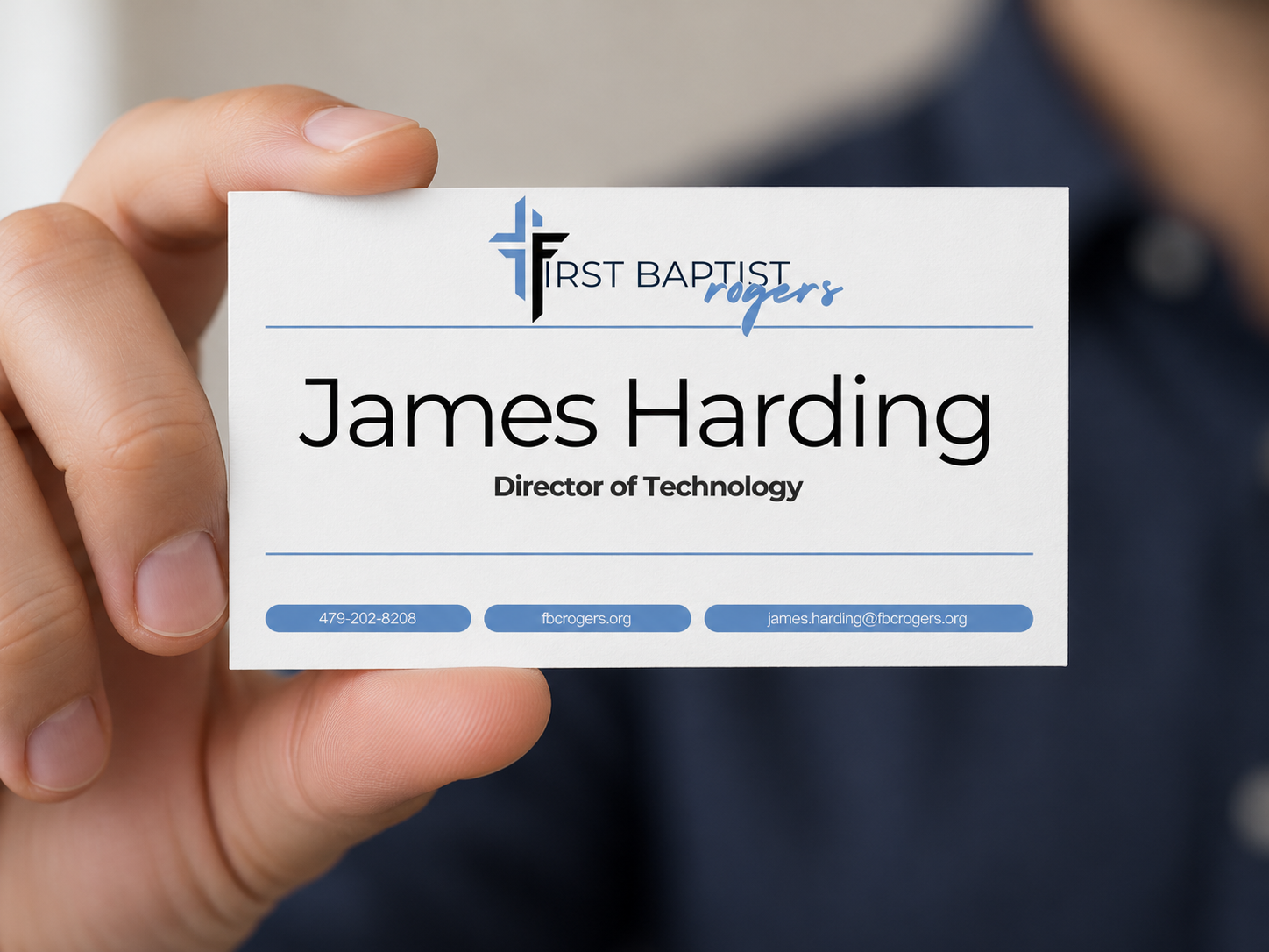
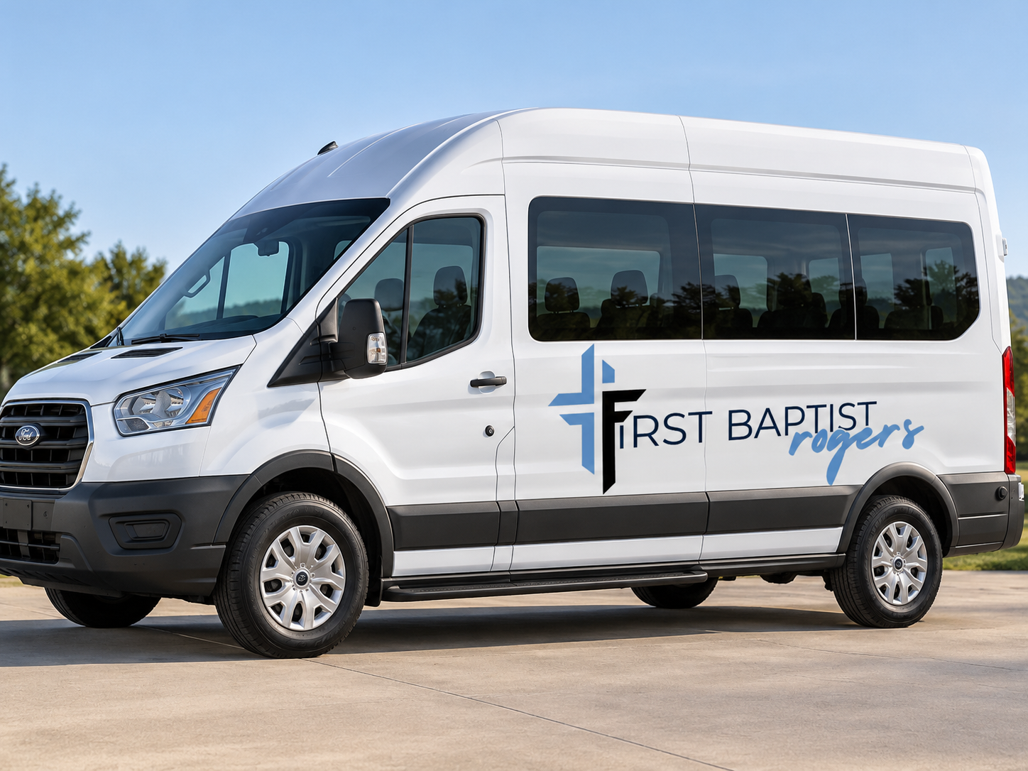
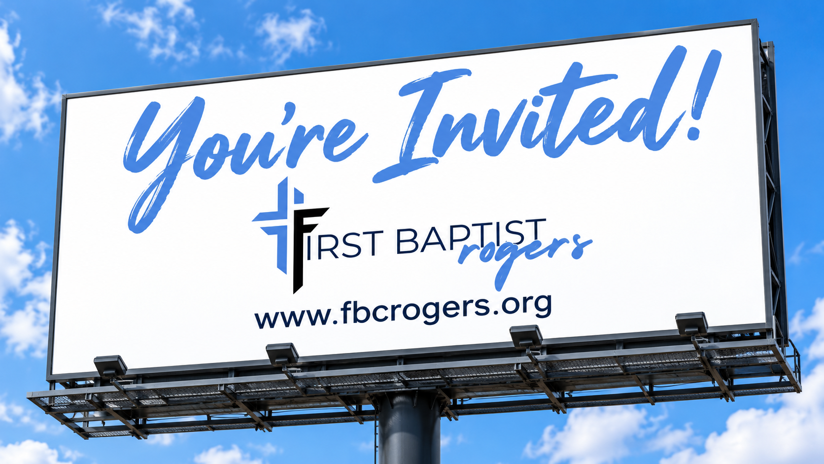
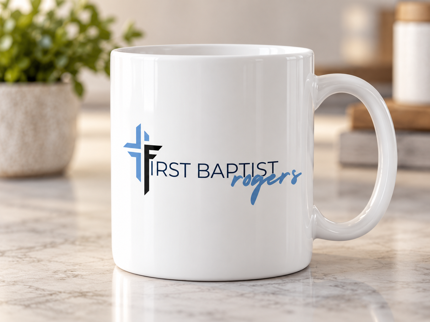
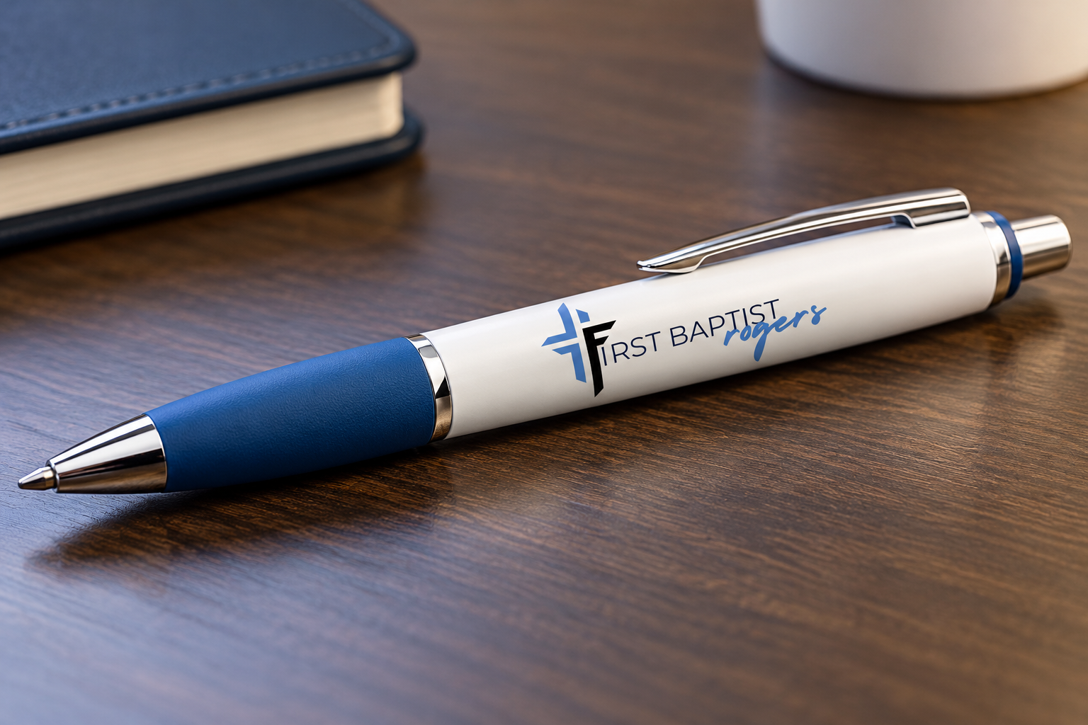
A strong identity needs to work beyond the primary logo. It should adapt to different environments, communication needs, and audiences without losing consistency.
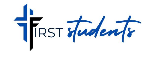
One concept incorporates ministry-specific accent colors, allowing individual ministries to develop a recognizable personality while remaining connected to the larger church identity.
The resulting exploration demonstrates how an established brand can evolve into a practical visual system designed for consistency, flexibility, and everyday use.
This project represents an independent creative exploration. The concepts shown are not an officially adopted rebrand of First Baptist Rogers.